Creating hover effects with Tailwind CSS

Nefe is a frontend developer who enjoys learning new things and sharing his knowledge with others.
Published on

The functionality and design of an application are some of the most important aspects of web development. Adding styles and visual cues to the different element’s states in our websites such as hover, focus, and more helps improve the user experience. We can also add animations and transitions that are triggered as the user interacts with our websites.
In this article, we will learn how we can add awesome hover effects to our websites with Tailwind CSS. The live link to the completed demo and GitHub repo are available.
Prerequisites
The knowledge of CSS and Tailwind CSS is advantageous to follow this article.
Tailwind modifiers
We can conditionally apply utility classes by adding a modifier to the beginning of the class. We can use state variants (to conditionally apply classes to different states of the elements on a website). Tailwind provides several modifiers for pseudo-classes, pseudo-elements, attribute selectors, and media queries. These modifiers allow us to target different states in elements and define styles for those states.
Understanding how hover effects work in Tailwind
We can use Tailwind’s hover modifier to create hover effects for elements. While we can target and style different properties of an element on hover, Tailwind does not allow us to chain multiple classes to a single hover instance.
That is, if we want to change the color and background color of an element on hover, we would have to declare multiple hover modifiers for the styles we want to change:
Even though we use multiple hover modifiers, they will all fire simultaneously.
Group hovers
Tailwind provides a group class that we can attach to modifiers. We can use this to style children elements based on the state of their parents. Let’s see how group hovers work:
We want to change the colors of the texts when we hover over their parent div. To do this, we start by attaching the group class to the parent div.
Next, we attach the modifier to the elements we are targeting. We added the hover modifier to the group class of the p tags then set the colors of the texts to change when a user hovers over them.
While we used a hover modifier in this example, we could have used any other one based on the state we want to target or the effect we want to create.

With that, we have a basic understanding of how hover effects work in Tailwind. Now, let’s go on and create some interesting hover effects.
Basic hover effect
Let’s start by creating a basic hover effect.
We want to create a box that increases in scale when someone hovers over it.
To do that, we add the hover modifier to the div and set the scale to increase. Since we cannot chain hover styles together, we add another hover modifier to change the background color.
The gif below shows the working hover effect:

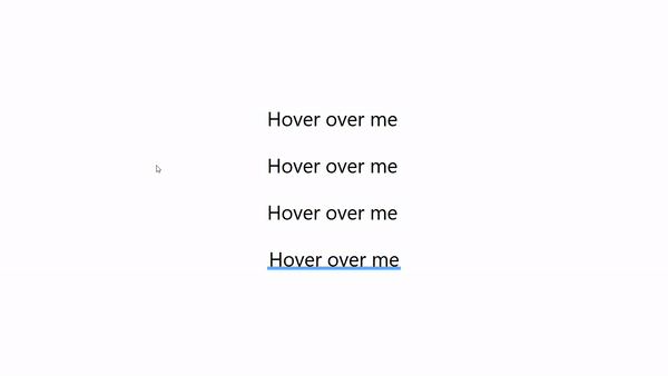
Text and link hover effects
In this section, we will create four hover effects we can use on texts and links.
We want to create a line that slides in from the left side of the text on hover:
The line will be an absolutely positioned span, so we set the position of the p tag to relative. We also add the group class because we will need that to set up the group hover. We will do these for every other p tag in this section.
We set the position of the span to absolute with the absolute class and use the left-0 to place it on the left of its parent, p. We also see its width to 0.
To create the hover effect, we add the group-hover modifier and set its width to 100%.
The second effect is similar to the first effect. The only difference is the direction the line slides in from. Here, it slides in from the right side of the text.
To make the line slide in from the right, we need to change the position of the span to the right of its parent p. To do that, instead of using the left-0 class, we use right-0.
We want to create two lines that extend from the middle of the text outwards to the left and right side on hover.
We have two span elements because there will be two lines. We set the position of both spans to absolute and their width to 0.
The lines will slide out from the center of the text, so we add the left-1/2 and right-1/2 classes to the respective lines. The left-1/2 class positions the left line 50% from the left and right-1/2 50% from the right.
Finally, we set their width to grow by 50% on hover with the w-1/2 class.
The final hover effect is a line that extends upwards behind the text on hover. Let’s create that:
We give the line a width of 100% with the w-full class. It should be behind the text, so we give it a negative z-index. Finally, we give it a height of 0.5rem with the h-2 class.
We want the line to grow and extend upwards on hover, so we set its height to 100% using the h-full class.
The gif below shows the working hover effects:
Shine hover effect
In this section, we will look at how to create a shining effect.
To create the effect, we need to add a custom shine animation to the tailwind.config.js file:
Now, we can use the shine animation:
In the code above, we have two divs, an outer div and an inner one.
Think of the inner div like a reflective film or layer that slides across the surface of a box.
The hover effect takes place in the inner div. The inner div is an absolutely positioned element that slides across its parent on hover.
We use the -inset-full class to place the div away from its parent, then on hover, we apply the shine animation.
The image below shows the absolutely positioned inner div.

The gif below shows the working hover effect:

Button hover effects
We will create three hover effects in this section.
The first one is a 3D hover effect. We want to give the button some depth and make it look pressed down on hover.
For this effect, we give the button a bottom box shadow of 9px, then on hover, we reduce the width of the shadow to 4px. With this, when we hover over the button, it has a pressed-down effect.
To make it more realistic, we push the button down with translate-y-1.
The second effect is a curtain that grows from the top-left corner to fill the button's background on hover.
The key to this effect lies in how we style the purple-box div. We set its initial width and height to 0 using the w-0 and h-0 classes.
Then, we position it on the top-left corner of the button by using the top-0 and left-0 classes.
On group hover, we set the width and height to 100% with w-full and h-full, which causes the div to grow into the button’s background.
Finally, we changed the color of the span to white on hover.
The gif below shows the working hover effects:

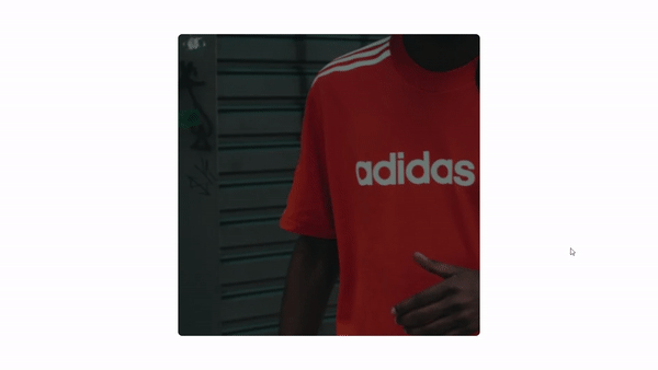
Card hover effect
For this effect, when a user hovers over the card, the image scales up and rotates while the background darkens.
We add the group class to the parent div because this will be a group hover effect.
We set the image to rotate with the rotate-6 class and to scale up with scale-125 on hover.
The inner div acts as the background that darkens on hover. We use the opacity-50 class to set its opacity to 50% so the image is visible. We increase its opacity to 80% with the opacity-80 class for the darkening effect.
We used Next Image for this effect, but it will also work for the HTML img element.
The gif below shows the working hover effect:
Flip hover effect
We want to create a card flip hover effect.
Tailwind does not support axis-specific rotations or preserve-3d, so we will create define some custom styles this effect requires.
We add the styles below to the CSS file where we add Tailwind to our project.
The styles defined in the card class’ hover state will rotate it along its Y axis, creating the flip effect.
The styles in card-back rotate the text on the back of the card, so they are in the right direction.
Let’s move on to create the front and back of the card.
On hover, we set the opacity of the card’s front to zero, so it doesn’t show when the card flips.
We apply the card-back class to the back of the card.
Here, we apply the card class we defined earlier and use the front and back of card components we created.
The gif below shows the working hover effect:

Gradient hover effect
When done right, using gradients as background images can enhance the visual appeal of websites. We can take gradients a step further by adding transitions to them.
It is currently not possible to animate gradients using the CSS transition property. That is, we cannot directly switch gradients from one color to another and add transitions to this switch.
However, we can create this effect using a simple trick. We increase the size of the background image then change the background’s position. It’s like when we zoom in into an image and focus on different aspects of the image.
This effect is similar to the Pan and Zoom effect where an area of an image or video fills the whole frame.
We animate the background-position property. Animating the position of the background image on hover will give us that gradient transition effect.
We need to create a custom utility for the background-size. We will need this utility to increase the size of the background. Let’s create this utility in the tailwind.config.js file.
We add a size-200 utility to make the gradient cover 200% of the div ‘s width and height.
Having added the utility, let’s create two gradient hover transitions.
For the first one,
We want the gradient to transition from red to white. To do that, we set the start of the gradient to red with from-red-500, the middle to black with via-black, and the end of the gradient to white with to-white.
We also use the size-200 utility we added earlier to increase the size of the background.
On hover, we change the background-position to the bottom right corner using the bg-right-bottom.
The second effect is similar to the first, the only difference being the direction of the gradient. While the first gradient starts from the top, we set this to start from the bottom right edge using the bg-gradient-to-br class.
The gif below shows the working hover effects:

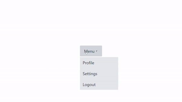
Dropdown hover effect
Dropdowns are a good way to create a list of links or menu items users can interact with. Let’s create a dropdown that will trigger when a user hovers over an element.
We have a parent div with a button and a list of menu items. We want to show the menu items when a user hovers over the div.
We start by adding the group class to the div. Since we only want the list to show on hover, we add the hidden class to the ul, which sets its display to none. Then on group hover, we set the display to block.
With that, we have created a dropdown menu, and we didn’t need to use any JavaScript.
The gif below shows the working hover effect:
Wrapping up
Hover states are an important aspect of developing user interfaces because they make our user interface much more appealing and give users useful visual cues where needed.
We have learned how to use Tailwind’s group class and hover modifier along with other utility classes to create different types of hover effects.
Data-rich bug reports loved by everyone
Get visual proof, steps to reproduce and technical logs with one click


Continue reading


Put your knowledge to practice
Try Bird on your next bug - you’ll love it
“Game changer”
Julie, Head of QA


Overall rating: 4.7/5
Try Bird later, from your desktop